Followers
Friday, December 31, 2010
New Shape of the Luxury Shop Le Printemps
Thursday, December 30, 2010
The Highest Building in Thailand
Architectural Pixels of the Cult Builder
The 77-storeyed tower has been designed by company OMA (Office for Metropolitan Architecture), earlier working over the project of cult skyscraper CCTV in Beijing. Naturally here again has not done without creative experiments: the skyscraper will be twisted by open terraces, so called — «architectural pixels».Wednesday, December 29, 2010
The Penthouse In London is Sold For $220 Million
The magnificent penthouse with six bedrooms in the London Housing Estate the One Hyde Park has been sold for the record sum of 220 million dollars that automatically gives them the status of the most expensive private apartment in the world.
Apartments for oligarchical persons
New owners will have access to the 24-hour service in apartments of hotel Mandarin Oriental: SPA, platforms for squash, wine tastings and protection of security guards which are the former members of SAS, elite division of the British armies.Sunday, December 19, 2010
Glass facade
This is a series for August 2010 which documents my on-the-ground -- and on-the-webs -- research for my guidebook to contemporary NYC architecture (to be released next year by W. W. Norton).
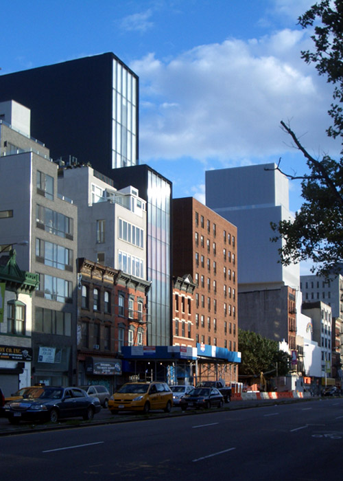
The Sperone Westwater Gallery, designed Foster + Partners, is nearing completion about a block north of the New Museum. This piece continues the transformation of the Bowery, from Cooper Union down to Chinatown. In the ten or eleven years since I stayed at a hostel on the Bowery the street has seen numerous new buildings as well as restaurants and shops, displacing the old flophouses and mainstays like CBGB's.
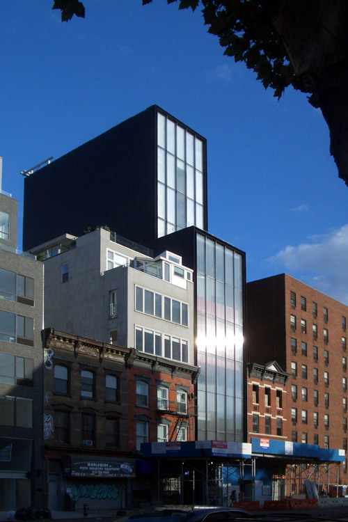
I always liked to think of the Bowery as un-gentrifiable, a zone immune to the changes in neighborhing SoHo, NoHo, the Lower East Side, and the East Village. Of course I was wrong, but a nine-story building with a bright red elevator on its facade is probably the last thing I would have expected from the alternative scenario.
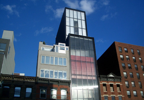
Norman Foster's design is the antithesis of the New Museum, which made the Bowery cool for institutions with money to spend on buildings by name-brand architects. SANAA's stacked and shifted white boxes respond to the zoning envelope without making that legal device explicit; Foster's design rises to the maximum street wall and then sets back once. Done.
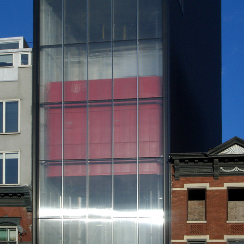
Granted, the 20-foot-wide lot doesn't give much room for play, so Foster focuses on the skins. Facing the Bowery on the first five floors is an all-glass wall with laminations that allow light and views, but the latter are indistinct, yet not so much that the elevator's workings aren't apparent. One effect of the glass, which lies somewhere between transparent and translucent, is the band of light visible in these photos. It must be an unwritten code that new buildings must have a surface that blinds passersby!
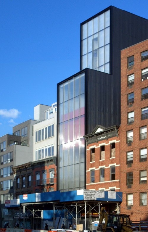
The side walls, facing north and south, are blanketed with black corrugated metal, the panels mimicking -- but oddly not following exactly, in size or spacing -- the glass on the front. The rear facade is similar to the top of the front, with a zipper of clear glass running vertically between what looked to be solid panels (not translucent like the front). Foster's design certainly has a strong presence on the Bowery, but its industrial elegance will pack more of a wallop at night when the glass box is illuminated and the red box glows.

The Sperone Westwater Gallery, designed Foster + Partners, is nearing completion about a block north of the New Museum. This piece continues the transformation of the Bowery, from Cooper Union down to Chinatown. In the ten or eleven years since I stayed at a hostel on the Bowery the street has seen numerous new buildings as well as restaurants and shops, displacing the old flophouses and mainstays like CBGB's.

I always liked to think of the Bowery as un-gentrifiable, a zone immune to the changes in neighborhing SoHo, NoHo, the Lower East Side, and the East Village. Of course I was wrong, but a nine-story building with a bright red elevator on its facade is probably the last thing I would have expected from the alternative scenario.

Norman Foster's design is the antithesis of the New Museum, which made the Bowery cool for institutions with money to spend on buildings by name-brand architects. SANAA's stacked and shifted white boxes respond to the zoning envelope without making that legal device explicit; Foster's design rises to the maximum street wall and then sets back once. Done.

Granted, the 20-foot-wide lot doesn't give much room for play, so Foster focuses on the skins. Facing the Bowery on the first five floors is an all-glass wall with laminations that allow light and views, but the latter are indistinct, yet not so much that the elevator's workings aren't apparent. One effect of the glass, which lies somewhere between transparent and translucent, is the band of light visible in these photos. It must be an unwritten code that new buildings must have a surface that blinds passersby!

The side walls, facing north and south, are blanketed with black corrugated metal, the panels mimicking -- but oddly not following exactly, in size or spacing -- the glass on the front. The rear facade is similar to the top of the front, with a zipper of clear glass running vertically between what looked to be solid panels (not translucent like the front). Foster's design certainly has a strong presence on the Bowery, but its industrial elegance will pack more of a wallop at night when the glass box is illuminated and the red box glows.
Saturday, December 18, 2010
Finnish Cathedral
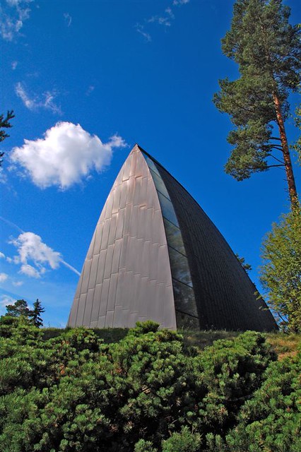
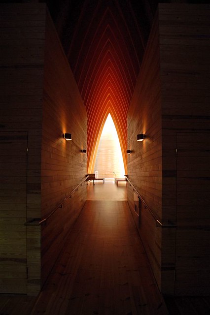
Here are a couple photos of St Henry's Ecumenical Art Chapel in Turku, Finland by Sanaksenaho Architects, 2005. Photographs are by peter and seija.


Thursday, December 16, 2010
Wednesday, December 15, 2010
Still Action Exhibition
For the exhibition Still Action -- on view at the School of the Art Institute's Sullivan Galleries in Chicago until October 2nd -- Brandon Pass designed, built, and installed (the last two with Nick Bastis) a kinetic wall installation for artists Elissa Papendick and Libby O'Bryan to "challenge and broaden the curatorial process as an artistic practice."

Inspired by anthropologist C. Nadia Seremetakis's concept "still-act" ("moments when a subject interrupts historical flow and practices historical interrogation"), on each Friday the gallery hosts different artists "who instigate aesthetic experiences that leave viewers with a heightened sense of awareness."

As can be seen in the image at top, the wall installation is more of a work surface than an armature for artistic expression, fitting with Papendick and O'Bryan's focus on curating for their residency. Some relatively mundane activities take place when the wall is opened as a desk (meetings, coordination, etc.), but all of the curatorial elements are then tucked away when the wall is closed.


These drawings illustrate how pieces hinge in plan and section, not just projecting from the wall but protruding through to modify both sides of the wall simultaneously. For example, the desk surface extends through the wall to become a small stand for a microphone and coffee or tea; curating and interviewing happen on either side but are interdependent on the same movable elements.

Function in the realm of the exhibition and the artists' tasks aside, I prefer the image of the wall in the closed position. Over time it probably won't have the unadorned appearance of above, but the combination of panels, reveals, and hardware give it the appearance of a cabinet of curiosities, or something like Ben Nicholson's Teloman Cupboard. One may not envision a simple desk and other accoutrements when open, instead letting the mind wander to whatever slender artifacts may lie behind the plywood. Regardless it's a small but dynamic and influential element within its surroundings that addresses the needs of the curators and over time the other artists as well.


Inspired by anthropologist C. Nadia Seremetakis's concept "still-act" ("moments when a subject interrupts historical flow and practices historical interrogation"), on each Friday the gallery hosts different artists "who instigate aesthetic experiences that leave viewers with a heightened sense of awareness."

As can be seen in the image at top, the wall installation is more of a work surface than an armature for artistic expression, fitting with Papendick and O'Bryan's focus on curating for their residency. Some relatively mundane activities take place when the wall is opened as a desk (meetings, coordination, etc.), but all of the curatorial elements are then tucked away when the wall is closed.


These drawings illustrate how pieces hinge in plan and section, not just projecting from the wall but protruding through to modify both sides of the wall simultaneously. For example, the desk surface extends through the wall to become a small stand for a microphone and coffee or tea; curating and interviewing happen on either side but are interdependent on the same movable elements.

Function in the realm of the exhibition and the artists' tasks aside, I prefer the image of the wall in the closed position. Over time it probably won't have the unadorned appearance of above, but the combination of panels, reveals, and hardware give it the appearance of a cabinet of curiosities, or something like Ben Nicholson's Teloman Cupboard. One may not envision a simple desk and other accoutrements when open, instead letting the mind wander to whatever slender artifacts may lie behind the plywood. Regardless it's a small but dynamic and influential element within its surroundings that addresses the needs of the curators and over time the other artists as well.

Subscribe to:
Posts (Atom)


